Obama's a Mac, and Clinton's a PC
From the NYTimes:
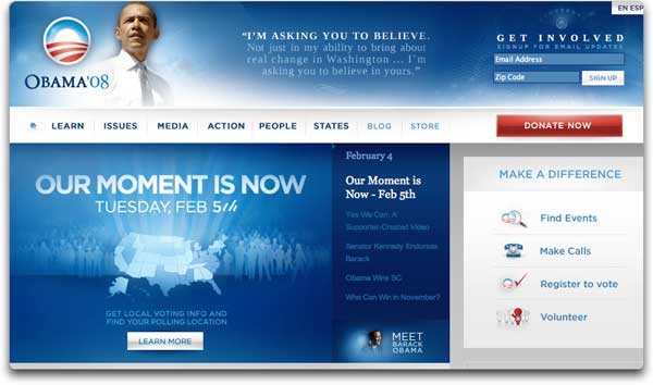
That is, Mr. Obama’s site is more harmonious, with plenty of white space and a soft blue palette. Its task bar is reminiscent of the one used at Apple’s iTunes site. It signals in myriad ways that it was designed with a younger, more tech-savvy audience in mind — using branding techniques similar to the ones that have made the iPod so popular.For your comparison (click through to see larger sizes):
“With Obama’s site, all the features and elements are seamlessly integrated, just like the experience of using a program on a Macintosh computer,” said Alice Twemlow, chairwoman of the M.F.A. program in design criticism at the School of Visual Arts (who is a Mac user).
[...]
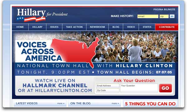
In contrast to barackobama.com, Mrs. Clinton’s site uses a more traditional color scheme of dark blue, has sharper lines dividing content and employs cookie-cutter icons next to its buttons for volunteering, and the like.
“Hillary’s is way more hectic, it’s got all these, what look like parody ads,” said Ms. Twemlow, who is not a citizen and cannot vote in the election.
Jason Santa Maria, creative director of Happy Cog Studios, which designs Web sites, detected a basic breach of netiquette. “Hillary’s text is all caps, like shouting,” he said. There are “many messages vying for attention,” he said, adding, “Candidates are building a brand and it should be consistent.”
But Emily Chang, the cofounder of Ideacodes, a Web designing and consulting firm, detected consistent messages, and summed them up: “His site is more youthful and hers more regal.”
posted by Agen @ 10:49 AM | Top o' the Cracks
0 comments
![]()


0 Comments:
Post a Comment
<< Home